In the beginning there was Cupcake
2008, when pinch-to-zoom was a right reserved for iPhones and BlackBerrys were still the business, a new kind of smartphone hit the scene: the Android smartphone.
Starting at version 1.5 for public consumption, Android was launched on the HTC Dream (known as the T-Mobile G1 in the US), a QWERTY keyboard-packing slider phone. Based on a modified version of Linux, Android offered something very different to the iPhone: freedom.
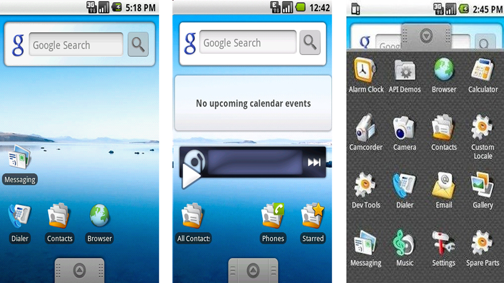
An open source Cupcake
Unlike iOS’s heavily policed, locked-down operating system, Android arrived with the promise of open source everything. Google made access to the Android Market (now called the Google Play Store) freely available, and users could even customize their home screens with widgets, offering in-app functionality from said home screen, no app opening needed.
With Android 1.5, codenamed Cupcake, a new way was born.
Android 1.6: Donut
Is it an albatross? Is it a jumbo jet? No! It’s the Dell Streak!
Version 1.6 of Android, Doughnut was announced in 2009, and it’s the update we have to blame for today’s giant phones that don’t quite fit in normal-sized pockets.
While Android tablets hadn’t quite taken off by this point, Donut was a step ahead, laying the foundations for the ‘phablet’, and introducing support for more screen sizes than Cupcake.
Big screens ahoy!
The aforementioned 5-inch Dell Streak, for example, despite being small by today’s standards, was a veritable beast when it was launched, and it owed its big screen to advances Donut introduced.
Other innovative features introduced in Android 1.6 included a text-to-speech engine, universal search and a more complete battery usage screen, so you knew which apps were draining your smartphone dry.
Android 2.0: Eclair
Who knew there was ever a time when you couldn’t have multiple Google accounts on your Android smartphone? We did!
Eclair, named for the choux pastry French patisserie staple, remedied account limitations and more.
Multi-touch me
But multiple accounts wasn’t the highlight feature of Android 2.0 – oh no. Eclair finally introduced multi-touch to smartphones that weren’t made by Apple (although that created something of a hoo-ha in itself.)
Take a picture, open it up, pinch to zoom… Android and iOS were in a two-horse race now, and Android was catching up.
Eclair also introduced Google Maps navigation, as well as additional camera modes, live wallpapers and Bluetooth 2.1 support.
Android 2.2: Froyo
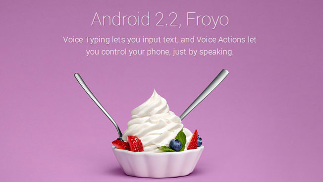
Froyo, aka frozen yoghurt, is confectionary number four, and Android version 2.2. Loaded up on classic phones like the Samsung Galaxy S2 and the HTC Incredible S, it marked the point at which Android hardware started to feel more premium, finally doing justice to the OS inside – from Super AMOLED screens bettering the LCDs of iPhones through to excellent industrial design from the likes of HTC.
Get some Froyo on that hotspot
Version 2.2 also introduced a feature that could make Android phones more attractive than iPhones for the everyday user – Froyo’s most practical highlight was most definitely mobile Wi-Fi hotspotting.
While Windows phones had Bluetooth and USB hotspot tools before, the idea of using high-speed Wi-Fi tethering to share your phone’s (then blazingly fast) 3G data with a laptop or even another smartphone was vindication for Android fans the world over.
Apple would take a full year to get the feature onto iPhones, with many carriers still blocking iPhone tethering for some time to come.
Android 2.3: Gingerbread

Android Gingerbread didn’t get a new look or feel compared to Froyo, but it did get a host of new features, including support for new sensors, including NFC. Other highlights included internet calling and a new download manager – but none of those were our highlights.
Copy, paste, catch up with Apple
Oh no – our highlight was the seemingly rudimentary and long-overdue copy and paste feature that was giving iPhones the text-editing edge over Androids for over a year: single word selection.
Before Gingerbread, Android copying was clumsy, given the fact that only entire text boxes could be selected. 2010 saw Google closing the gap, with a long press over a word selecting just that word, and displaying a pop-up menu that included copy and paste options, just like we have on Android phones today.
Android 3.0: Honeycomb
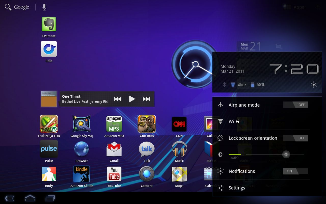
Remember the Motorola Xoom? No, not the Microsoft Zune – we’re talking about the Motorola tablet that introduced Google’s tablet version of Android, codenamed Honeycomb.
The most striking difference between it and any version of Android we'd seen before was the interface. Introducing ‘Holographic’ UI elements, Google went a bit Tron here – all illuminated lines, gradient halo highlights around objects – and while it didn’t look timeless, it did look cool.
On-screen navigation, the shape of things to come...
Android phones today seldom sport hardware navigation buttons; that’s to say, the back, home and recent apps buttons are in a navigation bar at the bottom of the screen on the biggest phones out now – the Google Pixel 3, Samsung Galaxy S9 and Huawei Mate 20 for example.
Funnily enough, we don’t have a mobile OS to thank for this – it was first introduced in Honeycomb, with the back, home and recent apps buttons displayed in the bottom-left of the home screen.
Android 4.0: Ice Cream Sandwich
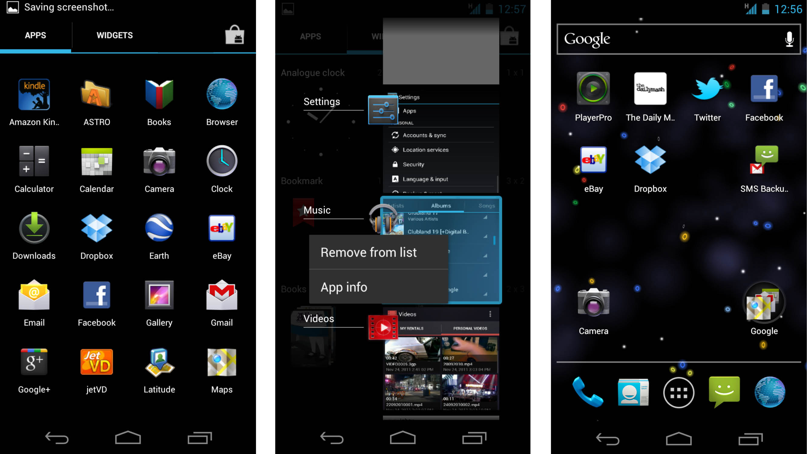
So long physical buttons, hello unified Android typeface!
Ice Cream Sandwich was probably one of the richest updates Android has seen. Available on the Galaxy Nexus and HTC One X, it brought an excellent in-gallery photo editor to the table, as well as a data limiter within the settings.
The whole look and feel was refined, in line with Honeycomb’s design direction, and it delivered a much richer experience than Android 2.3..
Swipe to dismiss
In hindsight, probably the most pervasive feature introduced in this version was the swipe to dismiss gesture.
While it had been used by other smartphone manufacturers before, getting Android users comfortable with this little swipe gesture ensured its rise to ubiquity.
Swipe to dismiss interaction has since, for example, shaped email and text message handling, influenced Windows 10’s touchscreen notification management, and is a fundamental component of everyone’s favorite dating app, Tinder.
Android 4.1: Jelly Bean

Jelly Bean was a tale of three parts: 4.1, 4.2 and 4.3.
4.1 was all about refinements. It took Ice Cream Sandwich and made it smoother, introduced improved support for multiple languages, and automatically resized widgets to fit your home screen.
Android 4.2 was a further refinement, this time polishing the look and feel, making for an excellent-looking tablet UI, showcased well on the Nexus 10, complete with Miracast wireless display projection support.
The final episode – Return of the Jelly Bean, if you will – was a corker for developers, giving them tools to improve UI smoothness, use the latest version of Bluetooth and restrict profiles on devices with multiple user accounts – handy for parents and businesses alike.
Expandable notifications
Our Jelly Bean highlight? Dragging down with two fingers for expanded notifications. This feature gave users a peak into the details of their most recent updates. So, if your notification read '3 new tweets', a two-finger drag down would expand the notification and showcase who those tweets were from, with a snippet of the message itself.
Simple, and still in Android today.
Android 4.4: KitKat
Emojis on the Google Keyboard, lower RAM requirements paving the way for budget Android phones, and NFC security being bumped up to help make mobile payments a reality – all this and more was loaded inside the Android 4.4 KitKat update.
'Okay Google, will this ever catch on?'
But it was Google Now becoming a voice assistant that blazed the trail for today’s world of talkative phone assistants and smart speakers.
The always-on microphone and 'OK Google' command were introduced alongside KitKat in October 2013, harnessing the power of Google Search.
It paved the way for Apple's Siri, set to follow in June 2014, and the two-horse mobile OS race was about to splinter into separate smartphone and a voice assistant contests, with Google making the early running.
Android 5.0: Lollipop
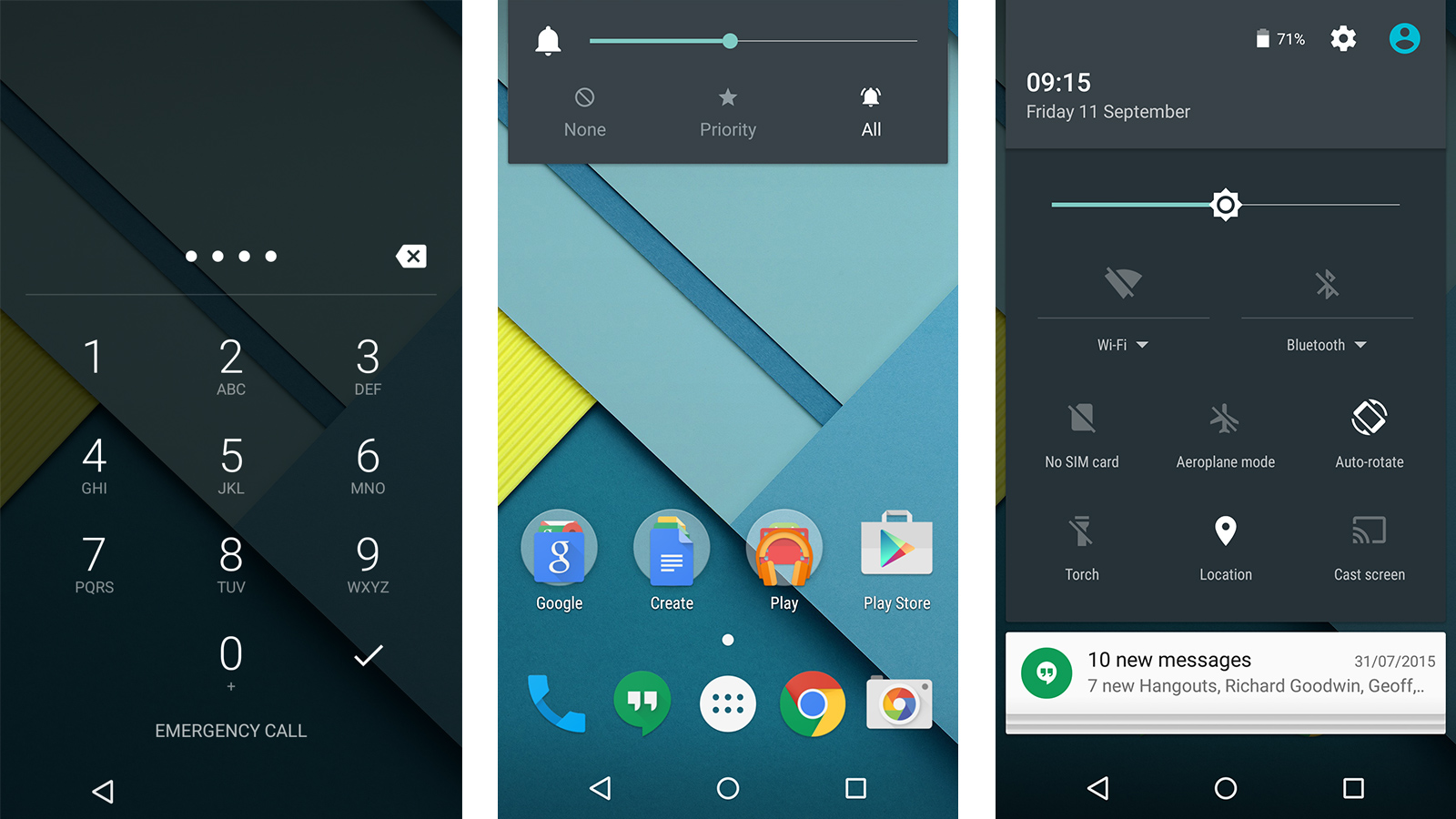
Material Design, Google’s flatter interface that features fewer gradients and a cleaner look than Jelly Bean, debuted on Android 5.0.
Support for 64-bit architecture was also introduced, helping Android achieve near-parity with desktop operating systems when it came to power potential, as was improved notification handling on lock screens.
Setting the scene for wearables
But the hidden gem within Android Lollipop was support for Bluetooth LE, or low energy.
This feature meant that wearable technology could finally exist without draining your phone’s battery dry. With lower battery demands, Bluetooth LE also enabled manufacturers to create smartwatches and fitness trackers with low-capacity batteries, small enough to fit inside a device that looked good and which could be worn comfortably.
Android 6.0: Marshmallow
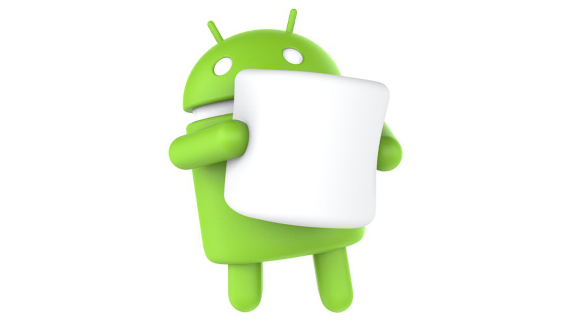
Launching on the Nexus 5X and Nexus 6P, these Marshmallow devices introduced USB-C ports and fingerprint scanners to the Nexus line.
As for the software, app security was tightened up with element-specific permissions prompting users to grant access to apps that needed to use things like their camera, phone etc.
Android 6.0 also supported MicroSD card integration into internal storage - handy for phones with under 16GB storage, though this feature has since been removed.
Doze mode
For a second time in a row, a battery saving feature is our Android highlight.
If you left your Marshmallow phone unplugged and stationary for a period of time with the screen off, apps go into standby and Doze mode is activated
This saved battery power and cemented Android as the operating system to go for if you wanted the battery edge, with Android hardware packing higher capacity batteries than iPhones, and its software optimised to take advantage of them.
Android 7.0: Nougat
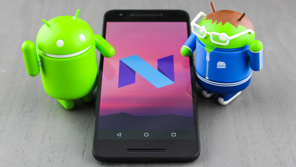
Quick app switching by double-tapping the recent apps key, gender and race-specific emojis, separate home and lock screen wallpapers… Android Nougat made things both more functional and more attractive, but it also borrowed something from Samsung.
Split-screen multitasking
Having introduced split-screen multitasking on its Note line, Samsung was ahead of the curve. Google lifted the experience, and made it part of stock Android 7 over a year later, allowing one half of the screen to be used for one app, and the other half for another.
Google did do some cool stuff with the feature – Android 7 offered split-screen handling of two Chrome tabs for example, and even supported dragging and dropping of an image file across tabs.
Android 8.0: Oreo
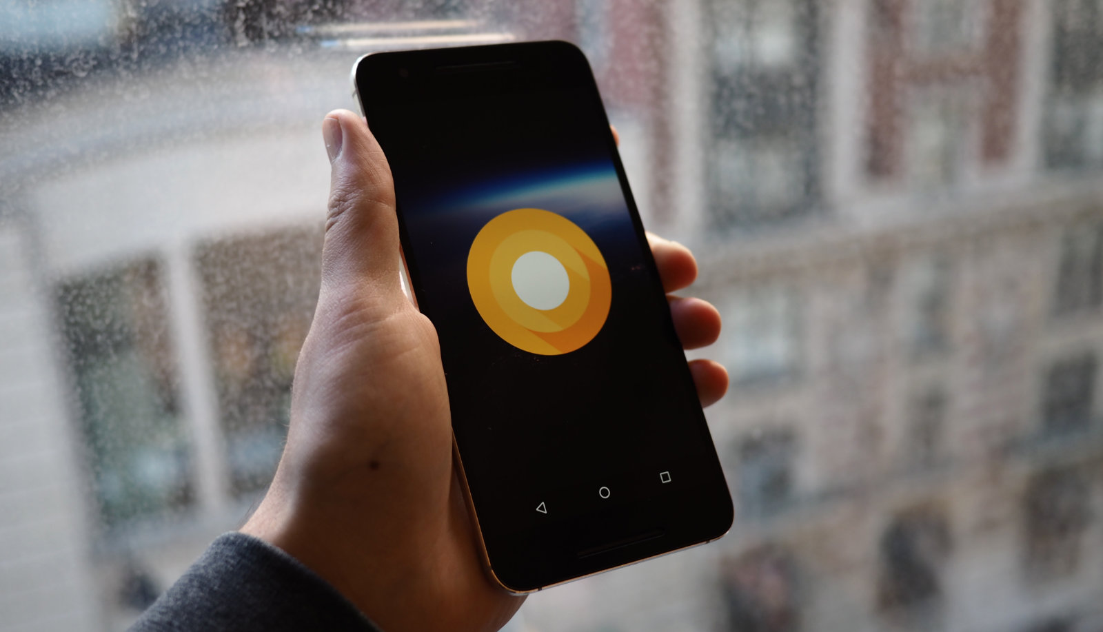
Shiny new battery menus and notification dots on app icons – Android Oreo brought with it a slew of refinements to the UI, not to mention better storage management, with a new file browser and more granular storage control within the settings.
Floating videos are cool, right?
But the highlight feature everybody wanted, and never ended up using when it launched, was picture-in-picture, another feature introduced by Samsung and later adopted by Google for stock Android.
This little floating video window showcases a video in your UI, so you can get on with Twitter scrolling without having to stop watching your favorite show.
While initially it was awkward to activate and, frankly, a bit useless, now it’s reaching fruition, with apps like Netflix, WhatsApp and YouTube having adopted support for it.
Android 9.0: Pie
We’re finally all caught up. Google’s 2018/19 build of Android, Android 9.0, aka Pie, is the freshest version shipping on the latest and greatest hardware, including the Pixel 3 and Pixel 3 XL.
Loaded up with notch support, improved battery smarts and a revamped UI, complete with iPhone X-esque navigations, Android Pie is gearing Google smartphones up for their impending all-screen, bezel-free futures.
A side serving of social responsibility
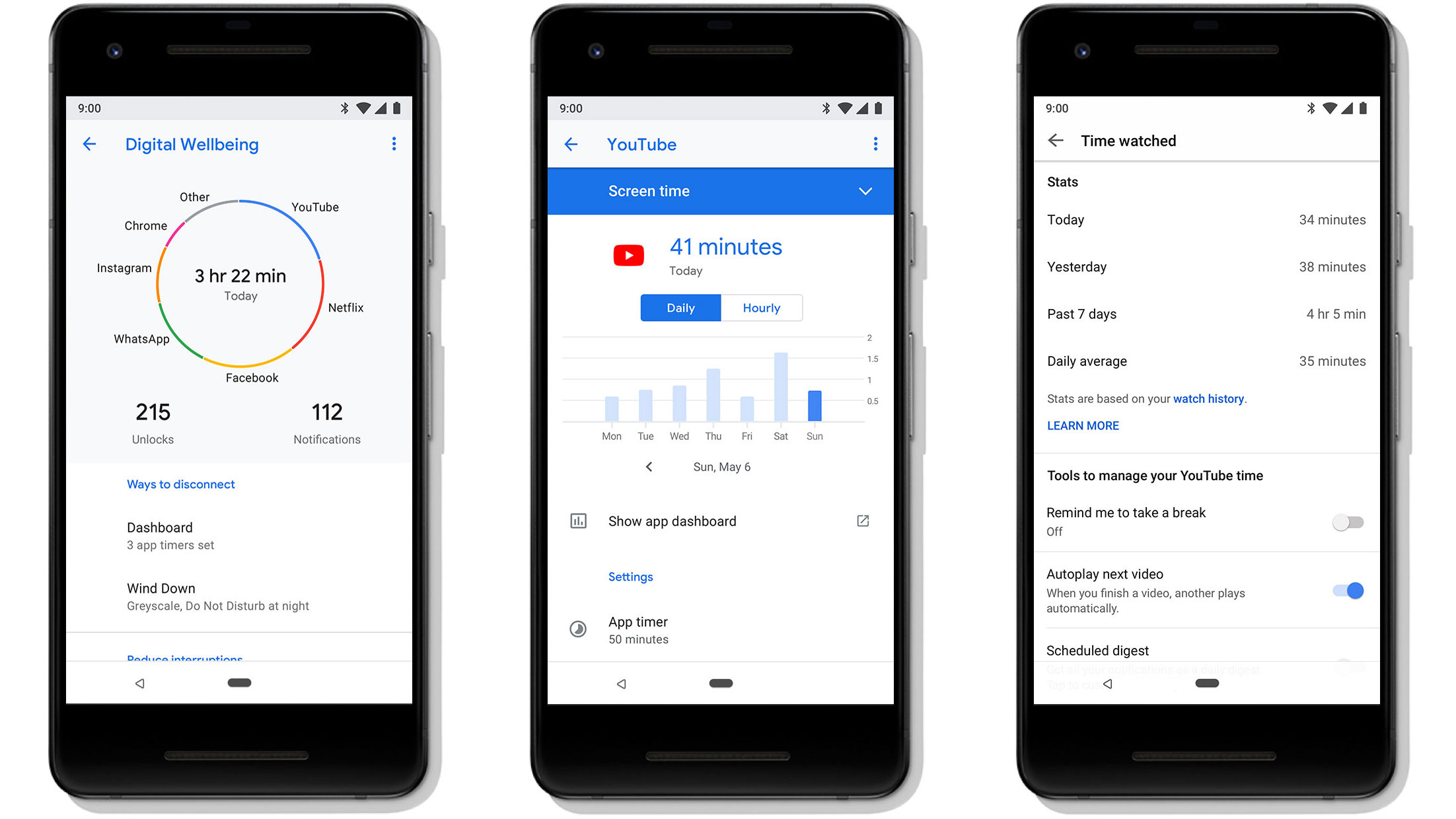
Digital Wellbeing is a suite of services available in Beta right now as part of the Android P update. Including elements like a dashboard to help you better understand your app usage, it’s all about using your phone a bit less, or at least a bit more mindfully.
Additional tools range from app limiters through to a grayscale mode to give your eyes a break, as well as a wind-down feature, to help you disconnect at the end of a working day.
With Google having iterated over 14 versions of Android, servicing more than two billion users, it’s a fitting conclusion to the current chapter that the big G has shifted focus to Digital Wellbeing, given the operating system’s vast reach.
Q is for… ?
But what about the shape of things to come? Android 10 will likely drop in the second half of 2019, and we already know it’s coming to the new Essential Phone.
As for its name, the distinct lack of confectionaries beginning with the letter ‘Q’ is keeping everyone guessing. Keep checking in with TechRadar throughout 2019 for the latest updates on Android Q, and to find out more about Pie, read our Android 9.0 overview.
- Brought to you in association with Nokia and Android One, helping you to make more of your smartphone. You can learn more about the new Nokia 7.1 here, and you'll find more great advice on getting the most from your phone here.
source http://www.techradar.com/news/android-through-the-ages-the-history-of-googles-smartphone-os
No comments:
Post a Comment